By Greg Nowak. Updated 13 October 2026.
A contact prompt can sit comfortably beside your desktop content and disappear below several screens of text on a phone. Moving it sounds straightforward, until the change affects keyboard navigation, duplicates a form, or gives editors another version to maintain.
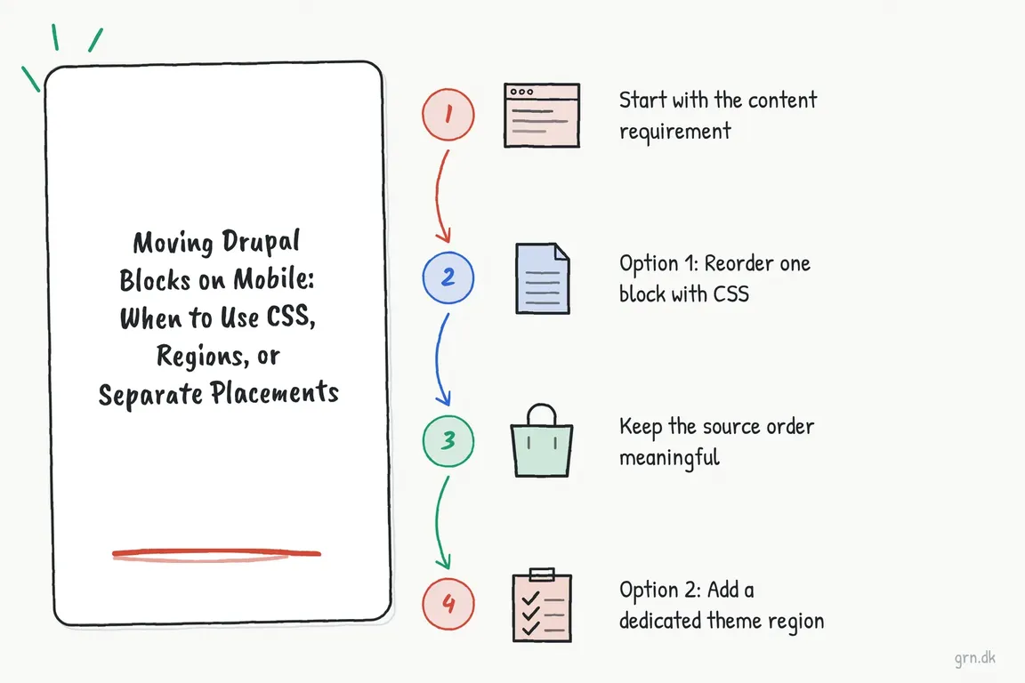
The useful starting point is the visitor’s task: what should they see before they inquire, filter results, or sign in? From there, choose between CSS ordering, a theme region, and separate placements. Each solves a different problem.
Decide what actually needs to change
Write the desired mobile sequence before discussing implementation. For example: introduction, inquiry prompt, detailed content, related links. Then check whether the block’s content stays the same and whether the existing page structure can support that sequence.
| What you need | Best starting point | Check before committing |
|---|---|---|
| Same content, different visual position | CSS ordering | Shared layout container and logical reading order |
| A position the current template cannot provide | Existing suitable region, or a new theme region | Template output and existing block placements |
| Different copy or offer on smaller screens | Separate editorial placements | Content ownership and duplicate rendering |
| Different arrangements on individual pages | The site’s established page layout tools | Whether editors already have the controls they need |
Check how the page is built, too. A block managed through Block layout and a component inside a page layout may require different controls. Avoid introducing a second layout system for one mobile adjustment.
Use CSS when one rendered block is enough
Keeping one placement avoids maintaining duplicate content or introducing a second instance of a functional component. CSS can change its visual position when the relevant wrappers are items in the same flex or grid container.
This example stacks three sibling regions on smaller screens:
@media (max-width: 767.98px) {
  .layout-shell {
    display: flex;
    flex-direction: column;
  }

  .layout-shell > .region-content { order: 1; }
  .layout-shell > .region-featured { order: 2; }
  .layout-shell > .region-sidebar-first { order: 3; }
}
These selectors are examples, not universal Drupal markup. Inspect the rendered HTML first. A block nested inside the sidebar cannot jump between content regions simply by receiving an order value. As the CSS order documentation explains, the property works on flex and grid items.
Use the theme’s established breakpoint rather than treating 768 pixels as a Drupal requirement. Put the rule in the theme’s loaded stylesheet or asset library. You only need THEMENAME.breakpoints.yml when Drupal needs breakpoint metadata, such as for responsive images; Drupal’s breakpoint documentation distinguishes that from ordinary CSS media queries.
Check the reading and keyboard sequence
Visual ordering does not rewrite the HTML source order or ordinary tab sequence. A button can appear near the top while keyboard users reach it much later.
A difference is not automatically an accessibility failure: W3C’s focus-order guidance requires a logical sequence that preserves meaning and operation. Test whether focus jumps confusingly between areas or separates instructions from their controls. If the task depends on a particular sequence, fix the template’s source order before styling it.
Add a region when the template needs a new position
A region provides a structural home for blocks. It does not automatically detect mobile screens or hide content on desktop. Prefer a name describing its purpose, such as “After header,” rather than tying it to one device size.
Add this entry to the existing regions mapping in THEMENAME.info.yml:
regions:
  # Keep every existing region entry here.
  after_header: 'After header'
This is a partial example. Declaring regions replaces Drupal’s default region list; omitting regions can disable their existing block placements. Preserve the full list.
Print the region at the intended position in page.html.twig and relevant variants:
{% if page.after_header %}
  {{ page.after_header }}
{% endif %}
Retain {{ page_top }} and {{ page_bottom }} in html.html.twig. These steps follow Drupal’s region guidance.
Run drush cr, then visit /admin/structure/block, select the active front-end theme, place the block, and save. Block placements are theme-specific, so check the selected theme during handoff.
Use separate placements for a real content difference
A shorter mobile promotion can justify a separate placement. Two identical contact forms usually deserve a closer look at the layout instead.
Separate placements do not necessarily mean separate content: two placements can reference the same reusable block. Different wording needs separately managed content or an established variation mechanism. Give placements clear administrative names and decide who owns updates.
For simple editorial blocks, stable wrapper classes can control viewport visibility:
.block-desktop-only { display: none; }

@media (min-width: 768px) {
  .block-desktop-only { display: block; }
  .block-mobile-only { display: none; }
}
This assumes block-level wrappers and the site’s chosen breakpoint. CSS hiding happens after server rendering; it does not guarantee that hidden blocks avoid processing, downloads, or attached scripts. Check analytics triggers as well.
Avoid duplicating forms, exposed filters, login controls, or cart components without testing IDs, validation, state, and script behaviour. Keep viewport presentation in CSS rather than assuming ordinary server-side visibility rules know browser width.
Agree on acceptance checks before release
- Test representative pages at narrow, intermediate, and wide widths, including long headings and translated copy.
- Complete the visitor’s task with touch, keyboard, and a screen reader.
- Check relevant anonymous, authenticated, personalized, and cached views.
- Verify forms and analytics produce the intended behaviour without duplicate events.
- Deploy theme changes and exported placement configuration together; document selectors, breakpoint, content ownership, and rollback.
If your team needs help choosing the approach, work through your Drupal layout change with Greg. Bring a representative page and the intended mobile sequence; those make a useful starting point for an implementation brief your developers and editors can follow.
Related on GrN.dk
- Your Best Content Is Behind JavaScript. Can AI Search Read It?
- Prompt Cache Write Costs: Check What Your Workflow Actually Reuses
- Before Your Support Bot Learns the Help Center, Make Sure It Can Forget
Need help with this kind of work?
Plan your Drupal layout change with Greg Get in touch with Greg.