By Greg Nowak. Reviewed 11 August 2026.
If you inherited a Drupal 8 website, inline image problems can look deceptively small: oversized downloads, inconsistent widths, awkward mobile layouts, and editors adjusting dimensions until a page looks acceptable. Together, however, they create an ongoing content operations problem.
The sensible objective is not to perfect an unsupported platform. It is to give editors a predictable workflow, reduce avoidable publishing errors, and define rules that can survive the move to supported Drupal. That usually means fewer presentation choices, reusable image styles, documented acceptance criteria, and a firm limit on legacy customisation.
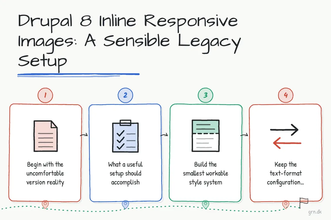
Begin with the uncomfortable version reality
Drupal 8 reached end of life on 17 November 2021. Drupal 8-only releases of contributed modules are also outside normal security coverage. Any work performed on such a site is therefore containment, not routine platform improvement.
Before changing the editor, identify the installed version of Inline Responsive Images, review local patches and custom modules, and confirm whether image handling is already part of an upgrade project. The old Drupal 8-compatible releases of Inline Responsive Images are unsupported. Installing one today merely to improve authoring requires an explicit risk decision; configuring an existing installation may be justifiable when the site must continue publishing for a limited period.
| Situation | Practical response | Avoid |
|---|---|---|
| Drupal 8 must keep publishing | Stabilise the existing workflow with a small approved style set | Turning the fix into a new editor platform |
| An upgrade is funded | Define image acceptance criteria and reproduce them on the supported destination | Perfecting behaviour that will soon be replaced |
| Problems affect listing pages or content types | Fix image fields, formatters, and view modes first | Solving structured-content problems inside body HTML |
| Module history is unclear | Inventory versions, patches, filters, and stored markup before changing configuration | Running a Composer command without understanding compatibility |
What a useful setup should accomplish
Drupal’s Responsive Image module maps image styles to breakpoints. This allows the browser to receive an image derivative appropriate to the layout instead of always downloading the original upload. Inline Responsive Images provides the editorial bridge: an author chooses an approved image or responsive image style rather than entering arbitrary dimensions.
This does not solve every image-governance problem. Responsive sizing does not write meaningful alternative text, choose an appropriate crop, verify image rights, or prevent an editor from uploading an unsuitable source file. Those requirements still need editorial guidance and validation.
Build the smallest workable style system
Start with actual content rather than an abstract list of possible widths. Review representative articles, identify the placements editors genuinely use, and create only the necessary image styles. Three options are often sufficient: inline_small, inline_medium, and inline_wide. Label them in language authors understand, such as “Small inline image,” rather than exposing implementation names such as “480w crop.”
Next, confirm that Drupal knows about the breakpoints required by the theme. CSS media queries continue to control the layout, but Drupal needs breakpoint definitions when the Responsive Image module must select image mappings. These live in the theme’s *.breakpoints.yml file. A compact example is:
mytheme.editor_images.mobile:
  label: Mobile
  mediaQuery: ''
  weight: 0
  multipliers:
    - 1x
  group: mytheme.editor_images

mytheme.editor_images.desktop:
  label: Desktop
  mediaQuery: '(min-width: 64em)'
  weight: 1
  multipliers:
    - 1x
    - 2x
  group: mytheme.editor_images
Use breakpoints that reflect the real theme; do not copy this example blindly. After changing breakpoint definitions, rebuild Drupal’s caches:
drush crCreate or review the responsive image style at /admin/config/media/responsive-image-style. Map each breakpoint to an appropriately sized image style, then test the generated page rather than relying solely on the administration preview. Check the rendered markup, the files requested in the browser’s network panel, the visual crop, and behaviour at common viewport widths.
Keep the text-format configuration restrained
The module provides two relevant text filters: Display responsive images and Display image styles. Enable one or the other for a given text format, not both. Expose only the styles approved for that publishing team.
Filter order matters. If the format uses Restrict images to this site or Track images uploaded via a Text Editor, the module documentation says its image filter should run after those filters. Test this on staging with new uploads and existing articles, because stored legacy markup can behave differently from newly inserted images.
Your acceptance test should cover at least one old article, one newly authored article, alignment, captions, alternative text, a narrow mobile viewport, a large screen, and a page served through the production caching or CDN layer. Record the expected result with screenshots or example URLs so another agency does not have to rediscover the rules later.
Separate the Drupal 8 fix from the modern destination
The current Inline Responsive Images 4.0 release supports Drupal 10.3 and Drupal 11 with CKEditor 5. Its Composer command belongs to that supported destination—not to Drupal 8:
composer require 'drupal/inline_responsive_images:^4.0'For an upgrade beginning now, assess Drupal 11 and the project’s Drupal 12 readiness rather than treating Drupal 10 as an automatically durable target; Drupal’s current schedule places Drupal 10 end of life in December 2026.
Also evaluate core Media Library and CKEditor 5 media embedding. Media entities are usually the stronger option for reusable assets, view modes, captions, and governed editorial workflows. Inline Responsive Images can still serve genuine body-image use cases, but it should complement a structured media model rather than become a substitute for one.
A pragmatic recommendation
If Drupal 8 must remain live briefly, make the smallest change that measurably reduces publishing errors: audit the installed code, define a short style list, configure breakpoints, verify filter order, and test real content. Then carry the documented rules—not unsupported implementation debt—into the replacement platform.
If you need an independent view of the safest scope, talk to Greg about your Drupal workflow and upgrade plan. A short technical and editorial audit can clarify what deserves fixing now and what belongs in the migration.
Related on GrN.dk
- AI disclosure rules belong in the CMS, not a spreadsheet
- Drupal 7 HTTPRL Network Errors: A Practical Fix and Triage Guide
- Inline Image Pasting in Drupal: Fast Editing Without Media Chaos
Need help with this kind of work?
Discuss your Drupal project Get in touch with Greg.